Wk Kellogg Co.
Over a century ago, William K. Kellogg – a pioneer in food – created the world’s first breakfast cereal: Kellogg’s Corn Flakes. His signature marked the first box, coupled with the slogan: “The original has this signature.” For 118 years, that signature has represented the entrepreneurship, passion, and great taste of an iconic company.
In 2022, when Kellogg Company announced its historic decision to spin off the North American cereal business as an independent, standalone company with a strategic focus on cereal, that signature remained a foundational anchor. It inspired every single element of the new visual identity, infusing the company’s spirit of innovation into its next chapter.
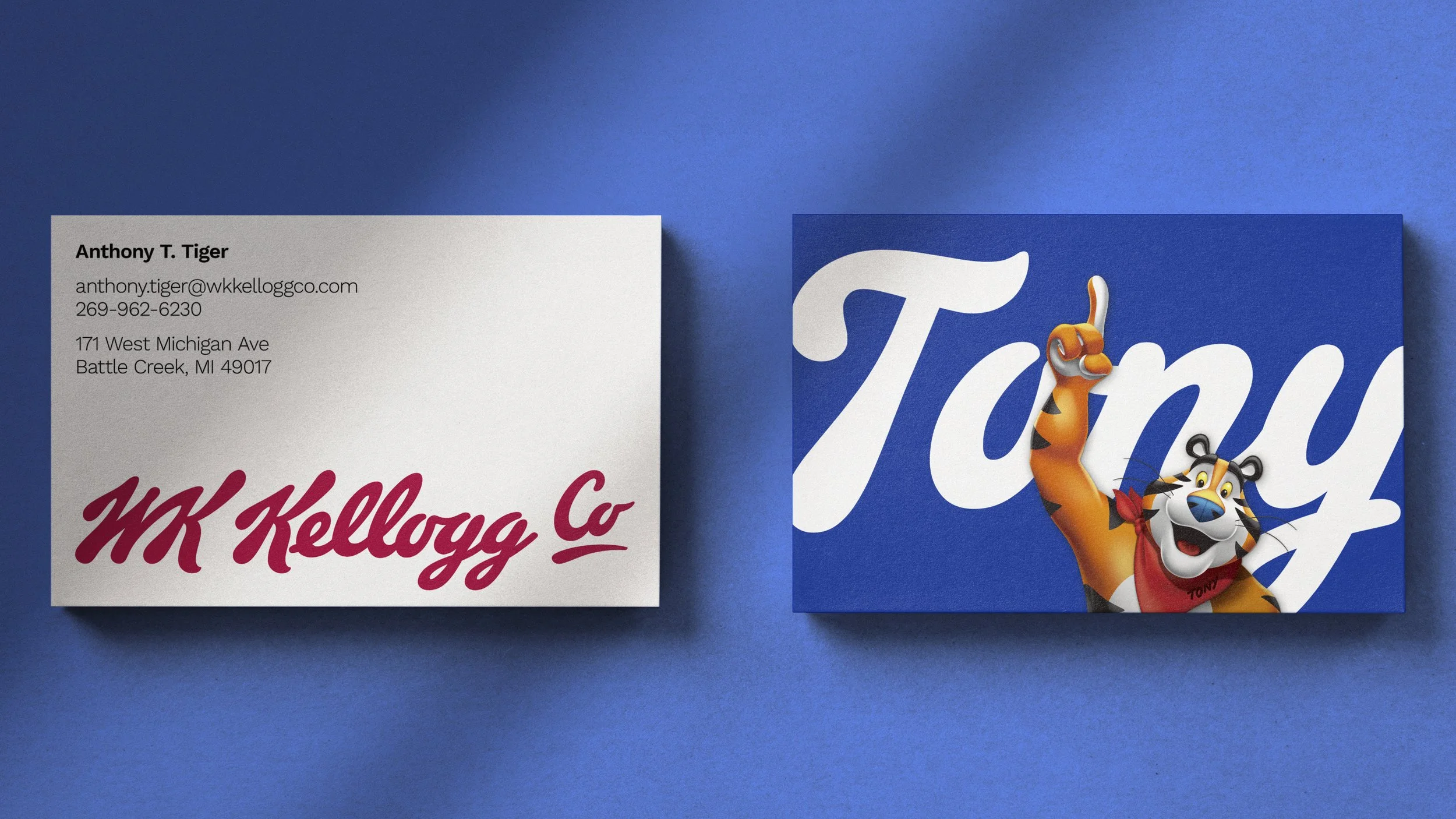
The name and wordmark honor the legacy of the company’s founder, W.K. Kellogg. The eliminated use of periods in the name also signals the start of a new, unwritten chapter, and the underlined and elevated “Co” expresses its ambition to take Mr. Kellogg’s original company to new heights.


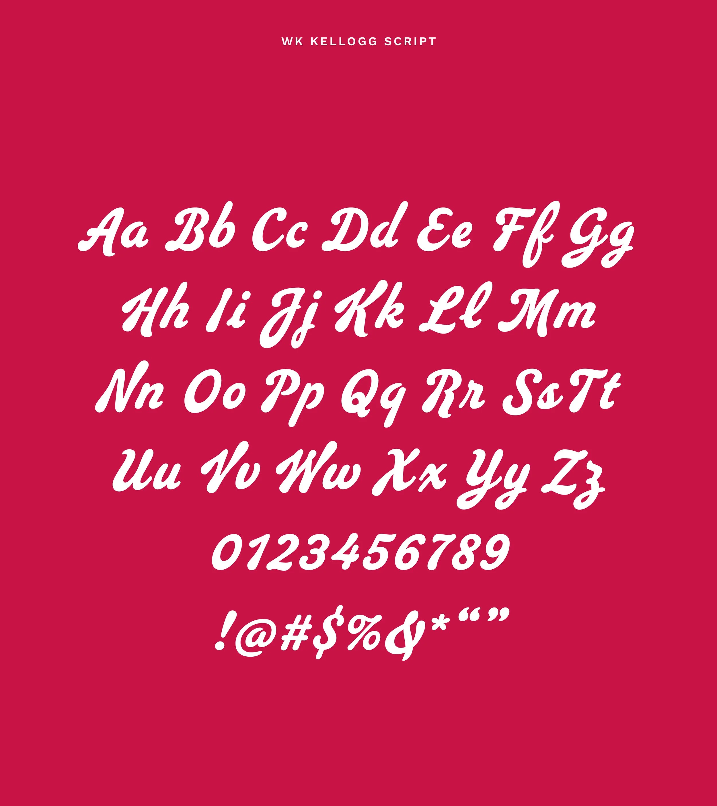
Typography is at the heart of this new identity. We collaborated with Ben Kiel and Jesse Ragan of XYZ Type and Rodrigo Saiani at Plau, to develop a custom script typeface for WK Kellogg Co. The result was WK Kellogg Script; a typeface marked by legacy and reimagining the future of cereal.
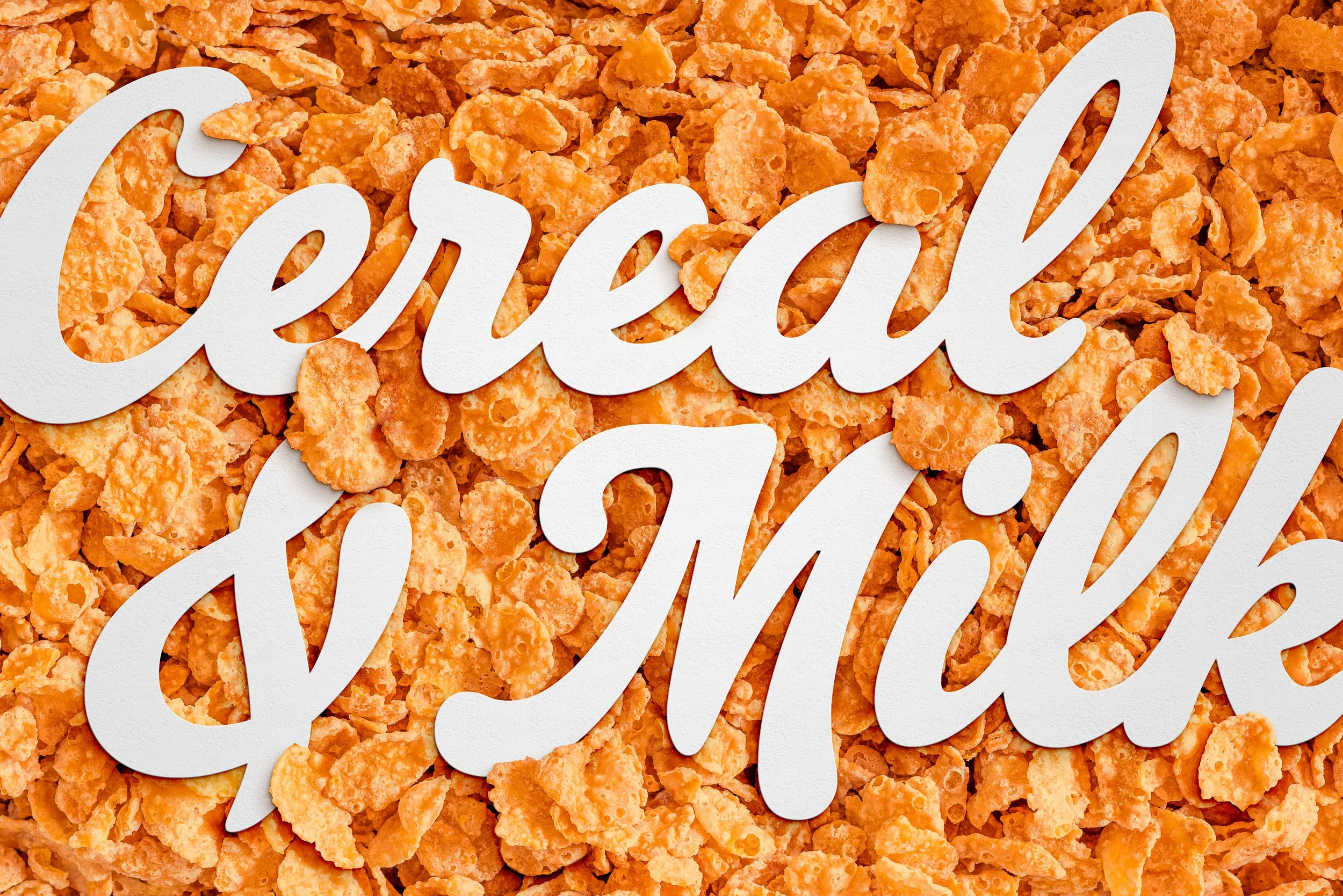
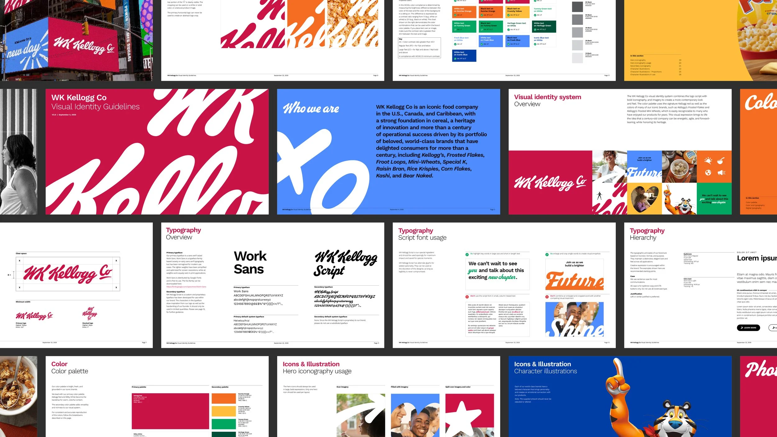
The wordmark, custom script typeface, and iconography system are all an extension of the same pen. And the warm, vivid colors evoke and re-energize the legendary cereal brands, tying together a visual identity that celebrates over a century of history while writing its bright, bold future.